So here is the thing...
There is no denying that photography is an art form. And like every piece of art, an image is "read" by the audience. They take in the details and layer on their own experiences to interpret what has been created. And quite often, it can be quite different from what the artist - the photographer - expected.
In the process of preparing for a shoot, photographers need to consider whether what they are creating will communicate the message they want to get across. This is even more important to understand when you are creating something for a well-known brand.
It can be a difficult thing to get right. Simple decisions such as how a person is standing, how light is hitting the subject and what colours are used can dramatically shift the vibes of an image. These small decisions can also be received differently by different audiences.
Now I am never going to bag on another photographer. Art is subjective. But sometimes I come across a photo that makes me stop and consider the behind-the-scenes thinking that went into the image. Why did they do that? And what could they have done differently? Or, I may stop and say, "wow, how can I do that?"
This new series is called "recreating the shot". My goal is to see how I can either "improve" (in my opinion) on an image or technically stretch myself to do something similar. I will walk you through the image, the decisions I *think* the photographer has made and some of the questions I might have about those decisions. Hopefully, this thought process is interesting for you.
And one final comment: this is not a criticism of other photographers. I am not perfect by any stretch of the imagination. It is more about reading an image, and sharing my thoughts.
A man lost in the shadows
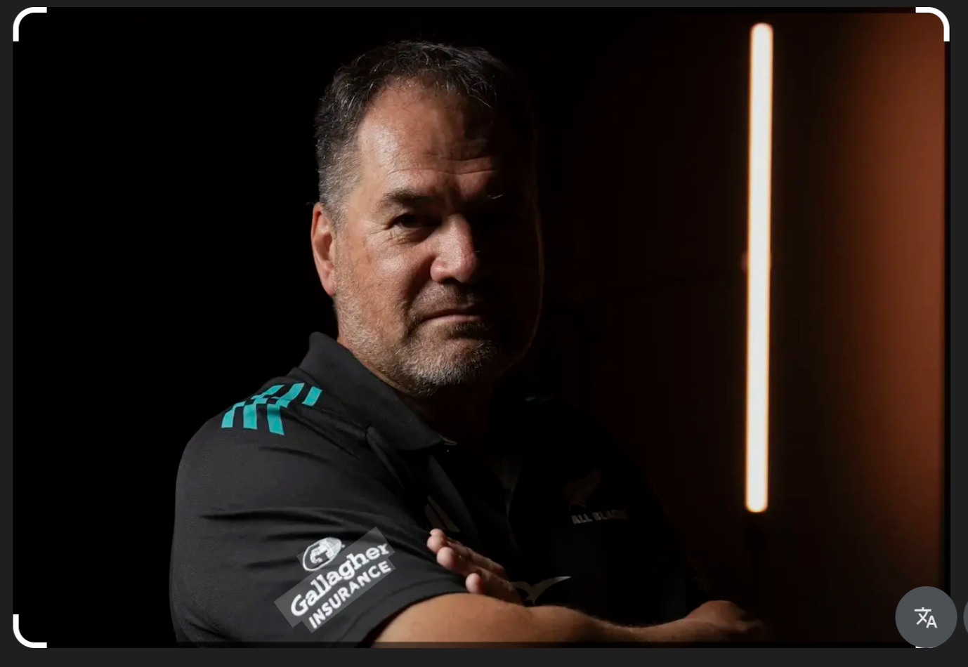
Dave Rennie (NZR/Action Press)
In March 2026, it was announced that Dave Rennie would take on the role of coach for the All Blacks. Rennie is well known, as are the All Blacks, so the photographer behind this image was bringing together two histories into one image. Before I talk about the photo itself, let's have a chat about what these are.
The All Blacks are New Zealand's national rugby team. By the very nature of the sport, the vibe of the team is one of strength, masculinity and legacy. The brand's colours are black and white or silver. Through the minimalist uniforms, the use of the haka and the wider presentation of the players, as well as the very sport they are playing, the vibe can best be described as "staunch".
Dave Rennie is described by those in the know as someone who is "hard-nosed, doesn’t tolerate fools, is astute and has a deep rugby intelligence.” Rennie himself has said his approach includes "rugby smarts and a bit of brutality".
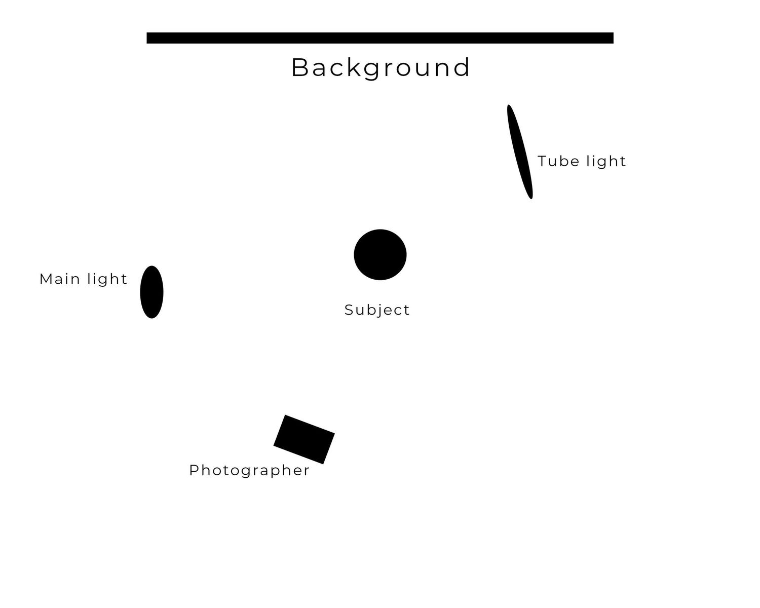
Why does this all matter? I would argue that the photographer of this image is trying to communicate the hyper masculinity of the All Blacks and the "hardness" of Rennie's persona. They are trying to create a staunch image, and I would argue that this is definitely the vibe that comes through with the use of shadows. They are using a version of the side light (where you light one side of the face and leave the other in darkness), though in this version the light is above Rennie, creating a "hot spot" on his forehead rather than even light across the whole face. There is a tube light in the background.
Here is a basic diagram of the lighting setup:
So, what's the problem? Well, I would argue that the photographer has pushed too hard on the masculine vibe. By casting Rennie in so much shadow, by hiding his eyes, the photographer casts suspicion rather than masculinity. Seeing eyes in a photo is vital because they serve as our primary focal point and emotional anchor. It connects the subject to the audience. The tube light in the background is also incredibly confusing - it is red/orange (not part of the All Blacks branding), and it pulls attention away from Rennie without creating separation between the man and the background.
I am not going to lie - I may have raged a little bit when I saw this image. My poor work colleagues. But after the rage, I thought about how I could recreate this image while holding on to the hyper-masculine vibe.
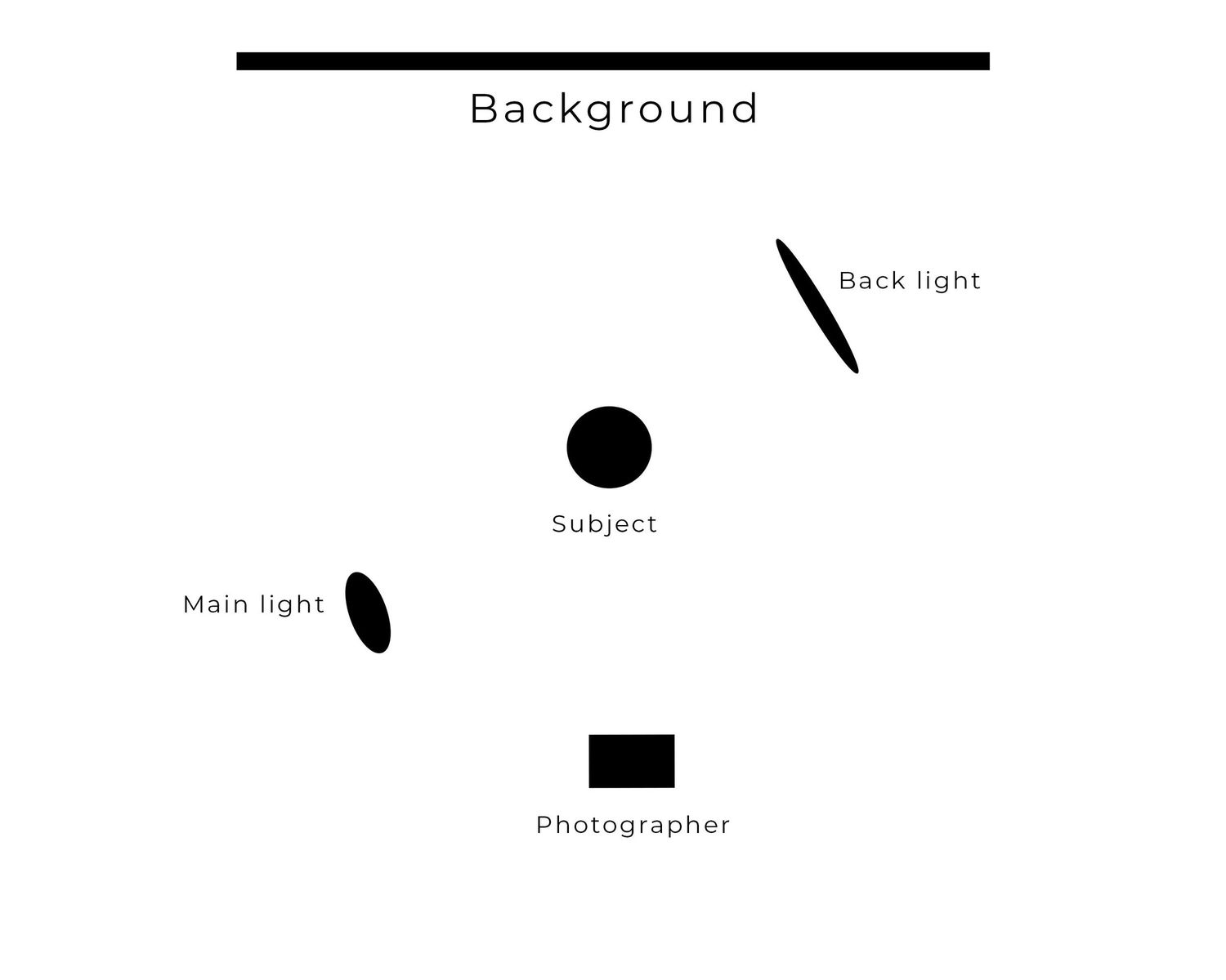
In my recreation, I moved the main light closer to the front - about a 45-degree angle from the subject (my wonderful and very patient husband). I changed the back light from a tube to a strip light and moved it closer to the subject, creating separation from the background. While my image is still dominated by shadow, I wanted catchlights in the eyes - the glints or reflections of a light source in his eyes. These small highlights add depth, dimension and life to the subject's gaze.
I kept the same pose but moved the camera to be directly in front of my husband. Doing this allowed me to move the back light closer without being in the shot.
Here is the diagram of my version:
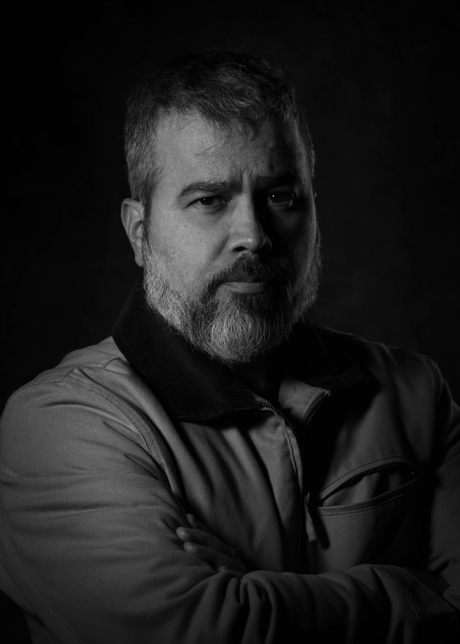
By making the eyes more visible, even in the shadows, I am encouraging a sense of trust. The catchlights also make the image feel more alive.
While not perfect - and I will probably try again at a later date - I think my version offers masculinity as well as trust.
So, what do you think? What would you do differently? And is there an image that you would like me to recreate?
